Tuesday, September 25, 2018

The Phillips Curve Rides Again

Just when you think the Phillips Curve vanished, it reappears. For those of you who have managed to steer clear of the concept known as the Phillips Curve until now, I would suggest pouring a nice JD over some rocks and watching the grass grow. For those of you who might be even a little curious about this Phillips Curve thing, then read on.

Phillips was one of those New Zealand economists with a lot of initials (A.B.H. aka A.W.H., aka Bill, aka William) before his last name who got famous by noting that there appeared to be a relationship between Ozzie and Harriett – no just kidding – between Ricky and Lucy – just kidding again – between the unemployment rate and wage changes.

This seems innocuous enough, but then real American economists decided to make Phillips even more famous by making the Phillips Curve the truly greatest thing ever in macroeconomics and skateboarding. The first thing they did was replace the wage variable with prices. Thus, they pondered a relationship between the unemployment rate and inflation (the percentage change in prices). I don’t think they got permission from Phillips to make this change but that’s all history now. 

Next they gave the relationship a theoretical foundation. Fancy words – theoretical foundation. The truth is that a monkey with the latest iPhone could have dug up this theory. But sometimes simple things catch on. And they catch on when they support the latest trend in macroeconomics. Recognizing that I am a bit north of my 70th birthday, please understand that when I talk about the latest trends, I am usually referring to the 1960s.

Unlike pink poodle skirts and flat-tops, macroeconomic trends stay around a while. My point today is that the Phillips Curve comes and goes in popularity, but as I was reading the Bible – err I mean the Wall Street Journal – this week it occurred to me that the Phillips Curve had risen from the dead again.
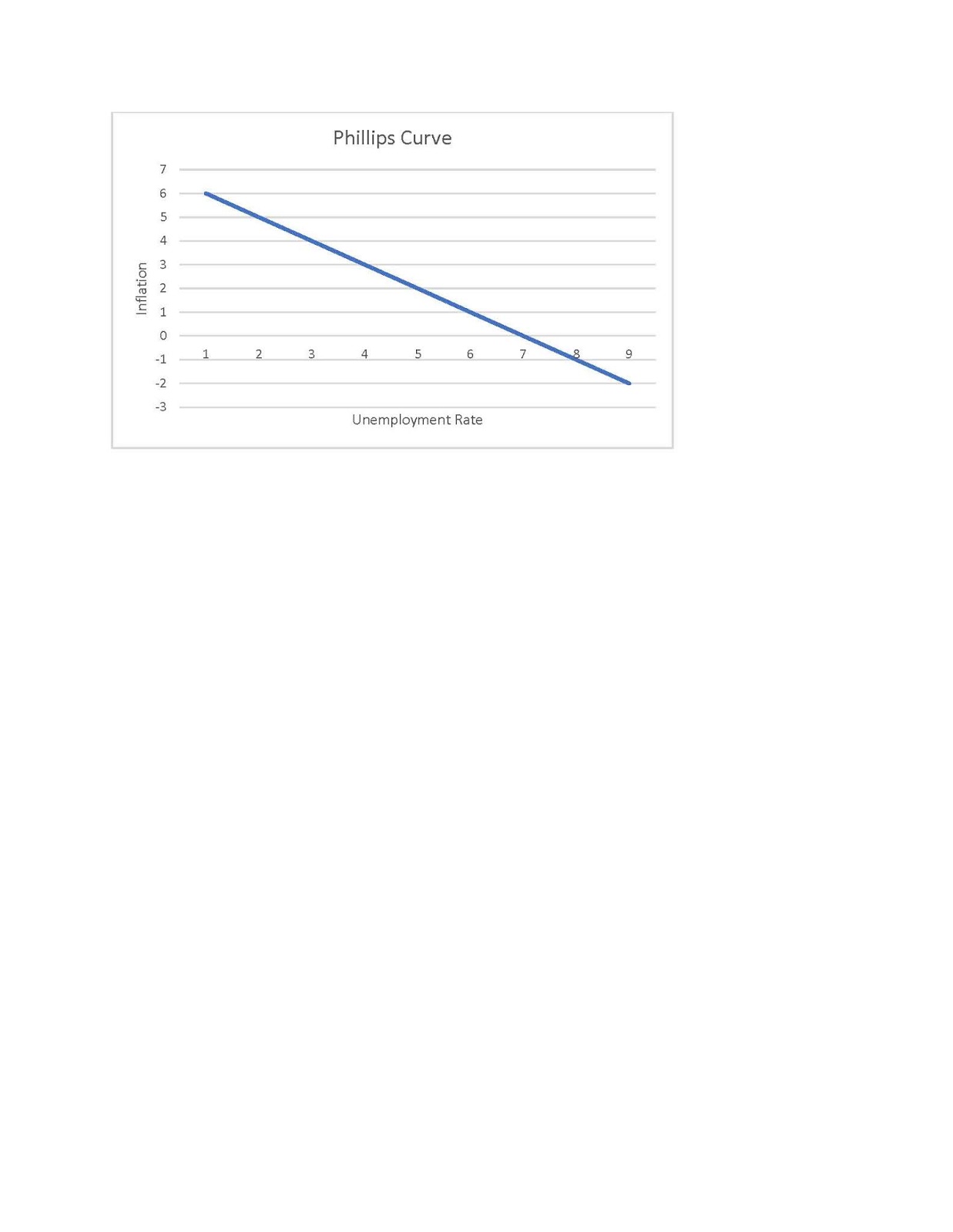
Before I get into those juicy headlines, let’s at least review the basics of the Phillips Curve. Below is a Phillips Curve diagram. The most popular aspect of it is the negative slope that reveals the inverse relationship between inflation and unemployment. Or in more common language, when one of them goes up the other one of them goes down. Sort of like a seesaw.

One might ponder further and say something like, “why?” Why is there a seesaw relationship? The answer comes from short-run macroeconomics and the part of it we call aggregate demand (AD). When households or firms or movie actors decide to buy more stuff, firms get very happy and respond by producing and selling more stuff. To produce more stuff they need more workers and so the unemployment rate goes down. As they hunt for more workers, they raise wages and then they must pass some or all of that wage increase on to their prices. 

Thus when AD increases – unemployment goes down and inflation goes up. Or when AD decreases – unemployment goes up and inflation goes down. Are you seasick from the seesaw yet? That’s basically it. Stay awake Fuzzy.

The big deal is that this little bit of theory is what is behind our love of using monetary and fiscal policy to rev up spending in a flagging economy. Monetary and fiscal policies are designed to pump up AD and therefore save the world from high unemployment – though at a cost of higher inflation.

To get these results, the Phillips Curve is not allowed to move around. It must sit still. Stay Phillips Curve. Stay. Good Phillips Curve. When the Phillips Curve does start to mosey around on the diagram, it messes up the nice seesaw and it ruins the simple world of monetary and fiscal policy. So when the Phillips Curve is jumping to and fro, we forget it exists. But when it sits nicely we take it for a walk.

The last 10 years or so, most economists would rather talk about soccer than Phillips Curves. The unemployment rates around the world went down – but the inflation rate just sat there like a squirrel on Zoloft. That is a sad story for the Phillips Curve. Bad Phillips Curve. 

But all that is changing now. Take Turkey for example. I was going to use Ham instead but we are actually talking about the country, Turkey. The central bank of Turkey recently decided to raise interest rates. And the government got steamed. Why was the government so mad? Because they believe that the rise in interest rates will reduce borrowing for spending and that will cause firms to produce less and fire a lot of workers. Of course, the country would benefit by a slide down the Phillips Curve to lower inflation rates. But the possibility of the higher unemployment rate was too much to risk. Clearly the government of Turkey believes in the Phillips Curve.

Japan is another example of the reincarnation of Phillips. Japan has been bathing in zero or negative inflation for decades. It now seems that inflation is making a comeback – a humble comeback but a comeback nevertheless. So should they be concerned with rising inflation and pull back on stimulus? And risk a rise in the unemployment rate? It's all about Phillips. A decision to curtail inflation will cause higher unemployment if you believe in the stationary seesaw.

It goes without saying that the same discussion is happening in the USA. The Fed has been moving interest rates upward for more than a year now and they plan to keep raising them in 2018 and 2019. A return to normal interest rates, like a return to normal temperatures after sitting in a beer refrigerator for hours, makes sense. But that bit of logic is trampled by the Phillips Curve. The curve was missing in action for 10 years but now all of a sudden it is more popular than a soju in Insadong. Surely if the Fed raises rates a couple more notches, the unemployment rate will rise. Surely if the Fed worries about inflation rising, unemployment will rise.

Okay. Enough about Phillips Curves. Next week I discuss the Davidson Curve. Just kidding again. Who moved my JD?


Tuesday, September 18, 2018

The Goods Trade Deficit Part 2

Last week I discussed the persistent US international trade deficit in goods. I concluded with two points. First, if the goods deficit really is a bad thing, a new approach might be necessary now after 47 years of trying has only made it worse. Second, I suggested that the goods deficit might not really be such a bad thing and that we might focus our policy efforts elsewhere. To make this second point I briefly made some points about trade in services and various assets.

This week I’d like to follow up with the idea that the trade deficit might not be such a bad thing.

To start with, discussions of US International Trade are supported by figures collected by the US Bureau of Economic Analysis and found in what is called the Balance of Payments (BOP). That’s a very misleading term and ought to be replaced by something like Stuff People Don’t Know about International Transactions (SPDKIT).

Even if this is likely to put the Tuna to sleep and cause Nathan to hyperventilate, I am going to educate you goonies about the BOP. I will do this with the below table which reports results for 2017. Once everyone is totally asleep I will then come back to the reason why all this supports my idea that the goods deficit is not such a horrible thing.  

First, the goods deficit of  ($808) billion is shown at the top of the table.

Second, just below the goods numbers are the services numbers. While some people like to say services can be aptly defined by what people at McDonalds do, services is a much broader category with some very sophisticated outputs and very high wage inputs. Services include at least the following industries – travel, transportation, finance, banking, education, retail and wholesale trade. Services account for about 70% of the US national output of about $21 trillion dollars. Notice that we had a trade surplus in services of $255 billion in 2017.

Third, the US is actively engaged in buying and selling financial assets. For example, Germans buy US government bonds and US citizens buy stocks of British companies. The table lists three types of cross-country investments which show purchases of Financial Portfolios, Bank Loans and Deposits, and Direct Investments. Financial Portfolios relate mostly to when we buy each other’s stocks and bonds. Direct Investments are when we buy each other’s companies. Loans and Deposits are self-explanatory.

Adding together the balances of these three financial accounts gives you a total surplus of $353 billion. Adding together the surpluses of these three plus services gives you a total surplus of $608 billion.

Tired of adding and subtracting?

One point of this exercise is that there is much more to international trade than goods imports and exports. Clearly a goods deficit of more than $800 billion has negative impacts. It does directly impact employment and it does manage to send US dollars out of the US. But a surplus in services does just the opposite. It increases jobs in the USA and it brings dollars back into the USA.

The story is similar for trade in assets. The financial surpluses show that foreigners love adding US bonds and stocks to their portfolios and they love buying ownership positions in US companies. The benefits should be obvious. When they buy ownership in companies they make it easier for these companies to raise money for investment purposes.

When foreigners buy US bonds and stocks they strengthen these markets too. As they drive stock prices up they lower the cost of capital to firms. As they buy government and private bonds they lower US interest rates and reduce the US cost of capital.

This latter point is more important than one might think. In the US we don’t love to save. We love to spend. As a result, capital is scarce and the cost of capital is higher than it should be. As foreigners bring their savings to the US they augment or pool capital and make it easier and less costly for us top borrow and invest.

This is getting a bit long so let’s wrap up. There is more to trade and to US health than goods. If we worry too much about goods we might threaten these other valuable activities. If bad policy on goods trade makes foreigners move their savings away from the US, then a lot of Americans will suffer as the stock market swoons and the cost of capital rises. Finally, global competition for US goods is not going to end with China. So long as developing countries want to compete with us and so long as their workers make only fractions of what our workers make, we will have a difficult time competing with them. Rather than bring all this activity home we should decide what we do best and what will sustain our workforce in the decades to come. 

Table (In billions of dollars)

Exports of Goods                              1,553
Imports of Goods                              2,361
     Goods Balance                                    (808)

Exports of Services                              798
Imports of Services                              543
     Services Balance                                  255

US Portfolio Investments Abroad       587
Foreign Portfolio Investments in US  799             
     Portfolio Investment Balance            212

US Loans/Deposits from Abroad       219
Loans/Deposits to Foreigners in US  384 
     Loans/Deposits Balance                     165

US Direct Investments Abroad          379
Foreign Direct Investments in US     355
    Net Foreign Direct Investments        (24)

NOTE: This presentations leaves out several smaller items that compose the US BOP Accounts so that we can concentrate on the main items. This presentation also does not mention that some of these items are part of the Current Account while others are part of the Financial and Capital Account.  

Tuesday, September 11, 2018

The Goods Trade Deficit

President Trump has made the US goods trade deficit the center of his economic agenda. He believes that the US is being treated unfairly when it comes to trade in goods. He concludes that this is bad for US workers.

Since international trade is like a giant sausage or at least a meter-long bratwurst, let's try to ignore for a moment most of the aspects of international trade and just focus on the US goods trade deficit. As its name implies, we now focus on only goods. That means for the moment we are ignoring trading of services and various kinds of assets. As Joe Friday used to say, "just the facts on goods ma'am." Okay, he didn't really say that but I had fun saying it anyway. Goods are tangible things that tend to stick with you. So we can begin with sticky buns. Trade in goods includes other tangibles such as agricultural products, autos, trucks, computers, phones, and much more.

The international trade balance in goods equals goods exports minus goods imports. In 2017, the US exported almost $1.6 trillion in goods to other countries. That sounds pretty impressive. But keep in mind two things. First, in 2017 the total amount produced of all goods and services (Gross National Product) in the USA was close to $20 trillion. So in terms of the whole amount of production, goods exports was about 8% in 2017. I would call that peanuts except it might be taken as an insult to peanuts.

Second, we sold $1.6 trillion of goods to people in other countries -- but here's the kicker -- we bought about $2.4 trillion from them. My friend Chuckie T. says that is really cool. We got a lot of stuff, and we didn't have to make it ourselves. But that isn't how President Trump thinks. He would prefer for all that stuff to be made here by US workers. That deficit of about $807 billion is a black eye. It represents to him what the US is losing.

So for a moment, let's stick with the black-eye interpretation. As anyone who has ever suffered a black eye knows, it is not a thing to cherish  It hurts. One must remedy it, but before we start throwing around remedies, let's turn to a bigger picture.

The goods balance has been negative since 1971. I found that information at the US Bureau of Economic Analysis (https://apps.bea.gov/iTable/iTable.cfm?isuri=1&reqid=62&step=2&0=1). I counted on my fingers and concluded that the US has had a goods trade deficit for 47 years. Wow. Turning around something that has been in deficit for 47 years could be quite an undertaking. The plot sickens -- I know it is supposed to be thickens but it really does get worse.

I used a graph from the St. Louis Fed (below) to show the goods trade balance since 1992. Notice some interesting things about that graph. First, the US goods trade deficit gets worse from 1992 to 2017. Second, the only thing that seems to improve the goods deficit is when we have recessions (vertical shaded areas in the graph) in the US that make us poorer and less likely to buy goods (both domestic made and imports). A cynic might conclude that recessions are great ways to reduce goods deficits, but one can plainly see that the remedial impacts of recessions are temporary. And that would be a very painful way to reduce deficits.

Let's suppose you lost undesirable weight gradually over a period of 25 years. We might conclude that extreme diets did not bring about that result. The continued desired loss of weight probably came because you made permanent and important changes in your life. And so it goes with goods trade deficits that have been around for 47 years and clearly worsening for 25 of those years -- there is something fundamental going on. And that something fundamental is not going to be easy to change.

We have had a lot of presidents and congresses in those 47 years, and it is probably true that not one of them organized a party to celebrate larger goods deficits. Yet, despite a lot of talk and some actions here and there, we are here in 2017 with goods deficits that seem to be getting bigger and bigger.

Let's suppose goods deficits are really bad for us. Then perhaps Trump's different approach to goods deficits is worth trying. Apparently his predecessors just made things worse. Their methods might have been sweeter and more humane but let's face it: if this is a problem, then sweetness may not be the best approach. If we want to reverse all those goods deficits, then it may take a fresh approach. You've heard of good cop/bad cop. Maybe it deserves a try.

Let's suppose, instead, that goods deficits are not so bad for us.  Seventy percent of our national output is services. We are very good at making and competing with services. Our services trade balance in 2017 was a surplus of $255 billion. As buyers we want goods and services. As producers we want to make services. So clearly -- we WANT a trade deficit in goods.

We also "export" a  lot of financial and real capital to the world. Maybe we should be focusing more on what we can do (services and assets) rather than what we can't (goods).


Tuesday, September 4, 2018

Wages, Employment and the Plow Horse Economy

Today's blog is about employment. For most of us, employment is a love/hate thing. No matter how exciting and challenging a job might be, there are days when you would prefer to pull the covers over your head and just chill as the alarm clock ticks on and on. But we know that if we do that every day, we might tire of watching Kelly Rippa and various other morning talk shows.

Work not only gets us out of the house, it gives us a paycheck. And that's the point of this exercise today. Last week I pondered why wages had been growing so slowing in the last decades especially when labor productivity was growing much faster. I was stumped. But then after a generous glass of JD, I got into a conversation with a neighbor and may have discovered at least one reason for the sad behavior of wages in the USA.

If productivity is rising, firms have more than one way to react to that happy outcome. They can enjoy the profits associated with the stronger productivity. Second, they can split the proceeds with their workers. Third, they can do neither and take the opportunity to exploit their new efficiencies by hiring more workers and beating the crap out of their competitors.

There are many factors that might cause firms to choose among those and other alternatives. Stockholders usually enjoy a nice dividend check, especially in January when they have to pay for the holidays. Workers just love a bonus or a pay increase. Honey, now we can afford the monthly payments on that new Lada SUV we always wanted.

What about the third choice? Why make existing workers and owners unhappy by hiring even more workers? One answer -- that came after the above mentioned JD (or two?) -- is that the choice may be affected by the firm's expectations about future economic growth.

We know that ever since the global recession of 2008-9, many people lost faith in the resiliency of the US economy. Some thought that the recession proved that capitalism had peaked. The rush to government control and regulation reinforced the idea that capitalism was breaking down. Even without such extreme beliefs, many simply saw reasons why economic growth might never return to those heydays when the economy could muster 3% or more growth each year.

Even in 2018, there are many dour forecasts that after a tax-induced sugar high, the economy will fall back into 2% growth. Imagine a mindset since 2001 that simply wasn't very sure that even moderate economic growth would return. Brian Westbury of First Trust named this situation the new Plow Horse Economy, with no intended insult to plow horses.

With such a dismal forecast, it might make sense for companies to do things that are reversible. They wanted to take advantage of the short-term strength of the economy, and they could do that by hiring more workers. When stagnation returned, they could reduce employment levels as necessary. They would not be stuck with higher permanent wages.

The behavior of wages and employment seem compatible with the above hypothesis. Last week I showed how average annual real earnings of the business sector barely rose in the years between 2001 and 2018. The graph below shows no similar phenomenon in hiring. The chart plots annual changes in employment (all employees of non-farm businesses) since 1939. The number 4,000 on the chart is in thousands so that represents a one-year increase of employment of 4 million workers. While that change didn't happen very often, we can use that as a benchmark for the largest one-year changes in employment.

We can also see that employment is banged around by recessions -- the vertical shaded areas. Ten times in the graph, employment declined from one year to the next. (An employment decline is a negative value on the chart.) Notice that employment dipped by 6 million workers in the latest recession.

The 2 million mark is interesting. Until 1965, the US economy did not have many years when employment increased by more than 2 million jobs. Between 1965 and 1998, it was common for the US economy to create more than 2 million jobs. The graph looks pretty messy right before and after the recession, but notice that in all 6 years (2012 to 2017) after the recession, the economy again produced more than 2 million jobs. 2018 will continue that record. The average change of those 7 years (2012 to 2018) will likely be around 2.54 million jobs per year.

It's interesting that the average increase in employment (leaving out the decreases in recessions) was about 2 million jobs from 1965 to 2001.

The point? A simple explanation for wage sluggishness might be companies preferring to weather the current economic environment by hiring workers rather than paying them more. But this could change. Wages have been responding to tighter labor markets in the last few years. But much depends on expectations about the future. Are we on a sugar high? Or will we return to historical economic growth? If and when expectations turn more positive, we should see those wages returning.